Swallowed quickly. Aguulp required a visual concept to match their innovative liquid supplement solutions.

With the abundance of competition in the supplement sector, Aguulp needed an identity system that would break them away from overused taboos and clichés to something straight to the point yet remain familiar.

Running with their tagline “supplements made simple” led to clear communications across the brand that break down the sometimes intimidating scientific jargon into digestible snaps of information.

The custom logotype illustrates exactly how the product is taken, a visual representation of the throat action when you gulp. This illustrative style removed the need for gimmicky, over used imagery allowing it to clearly stand apart from the rest.

A fun and playful colour palette, paired with the custom logotype, resulted in premium but approachable packaging that contrasts the brash tone of voice and candid imagery.

Our website design concept is where the snappy headlines flourish. The consumer can understand what the supplements will do even quicker than they can take it.

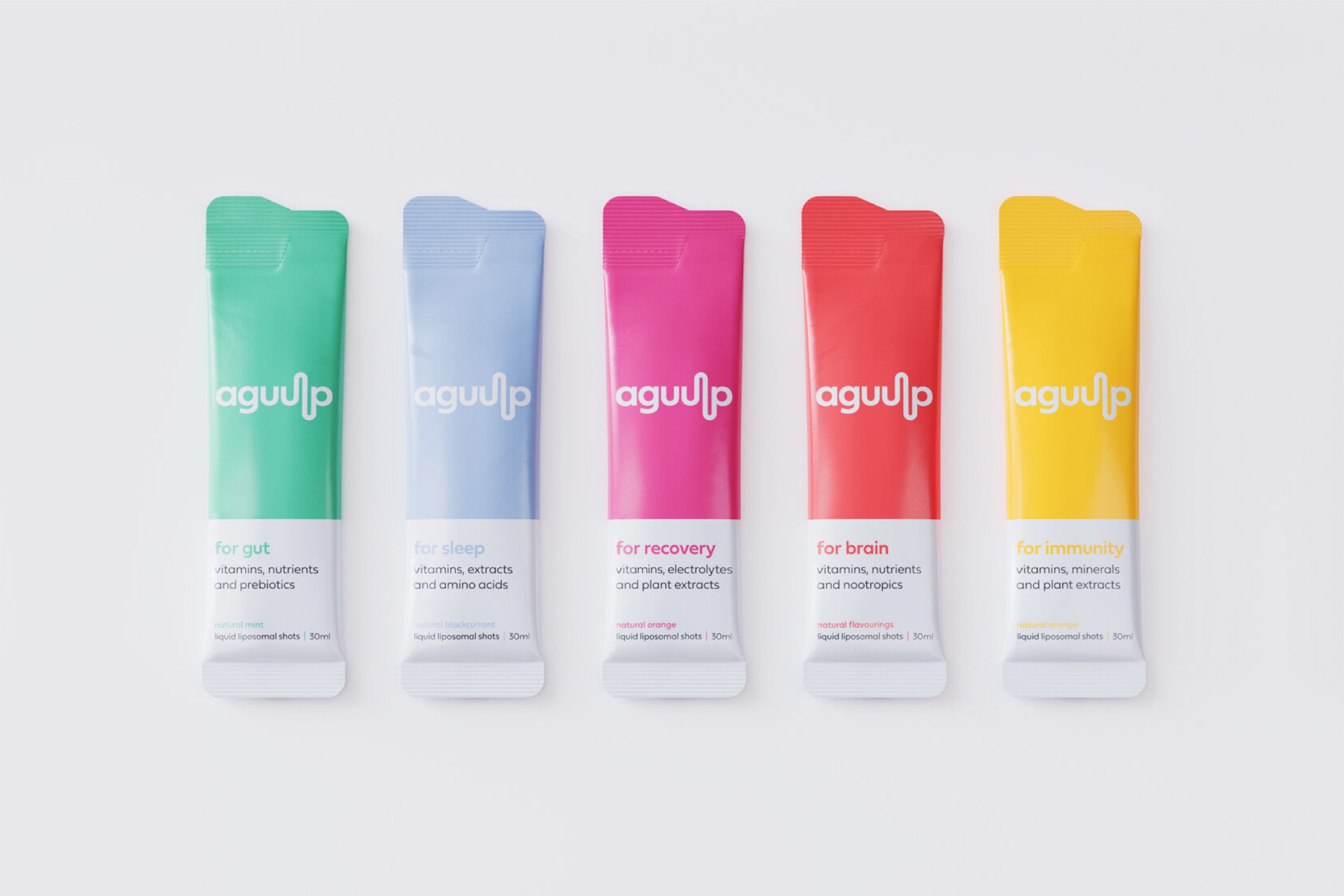
Aguulp positions itself more as a lifestyle brand than a medical product. The imagery and colours pair with sharp but educational statements to create intrigue and spark conversation.

Custom iconography adds a graphical element to the text heavy packaging, giving each product its own unique identifiable code to pair with its colour.

Post re-brand and complete packaging overhaul, Aguulp secured nationwide listings with Boots and Superdrug with their range of supplements now stocked in over 500 stores.