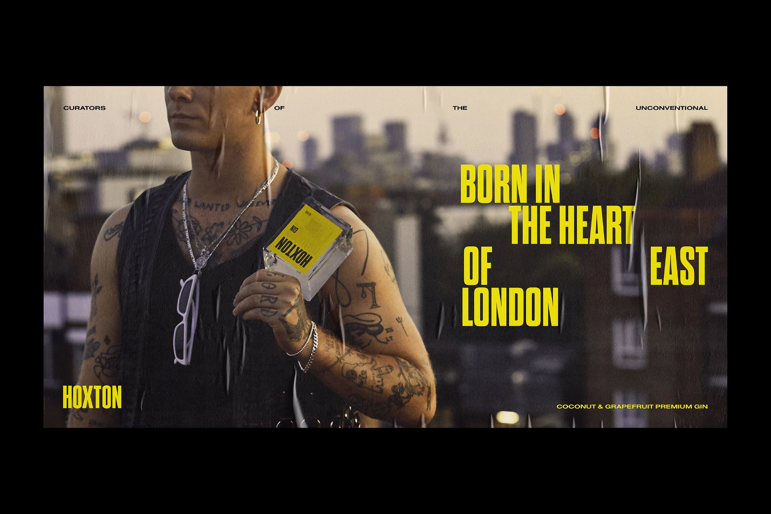
A rebellious spirits company needed a rowdy new look to match their unconventional flavour combinations.

Inspired by defying art movements of the early 20th century, Hoxton Spirits required an adaptable identity system and impossible to ignore packaging solution which unapologetically stands out amongst its competitors.
Originally marketed with a warning across the front of the bottle, this idea was adapted to utilise the typical colours associated with hazard signs which is referenced throughout the concept communications.


Since its launch in 2012 their flavour combinations have been grilled and criticized by traditionalist. These questions were the perfect call to action for their re-launch, turning the negative comments into positive promotion.


Hoxton Gin takes the avid gin drinker way out of their comfort zone and this is mirrored with the use of awkward typography spacing and sporadic alignment across all communications.
And just to make clear that this is certainly not your average gin, the label is as far removed from its traditional competition as it could get.

